Where SQL shines in analytics, queries, and calculations, Tableau is a visual tool for representing data points in a way that is meaningful but more importantly accessible to the less tech-savvy users.
If you’ve ever pen asked to create a pie chart or wanted to show sales forecasts for your team in line or bar graph format to illustrate a point only to bang your head against the wall in excel to try and figure out how to create the visual, then you are the exact user Tableau has targeted for its data system, says Joseph Zulick, manager at MRO Electric and Supply
A picture may be worth a thousand words but if you ask anyone in communications or marketing they can tell you it’s worth thousands of dollars!
When you are trying to illustrate raw data and you pull up a slide with individual data points on a table displaying just numbers, you probably have lost your audience. Tableau can make or break the difference between your project getting approved or getting a hard pass.
The emphasis of Tableau is the illustration of facts in a very user-friendly visual representation. It has a lot more involved in this data such as easier to gather formats that permit simple graphical representations of what it is you want to bring together and combine.
Think back to the early computing days before GUI or GRAPHICAL USER INTERFACES. Before this advent, you needed to have some knowledge of computing on how to ”run” a program. You also needed to know how to find that program to know it was available. We can now improve the user experience to expand the usage to the broader audience in the same way the home computer is now the staple of most businesses. Most of us now have a supercomputer in our hands when using our phones.
The user experience has a very flattened learning curve compared to using other data gathering systems. The more illustrative the data is the better communicated the message will be. This leads team members to use the system directly as opposed to making data requests through IT or the data analytics team or person.
Many users mistakenly look at the tableau and excel as either/or tools. But, the reality is they both have their place and in many cases strengths and weaknesses.
If you are doing advanced spreadsheet functions and multilayered calculations you’ll want to incorporate excel and its very powerful spreadsheet functions but when it comes to displaying the message of the data, Tableau is the clear preferred leader.
Data visualisation can improve buy-in and support for the information and is far easier for high-level communication where the finite details become more of a hindrance to the comprehension of the data and not a benefit.
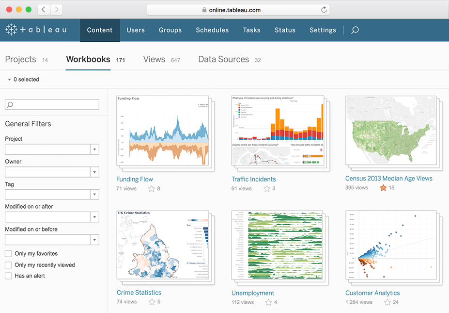
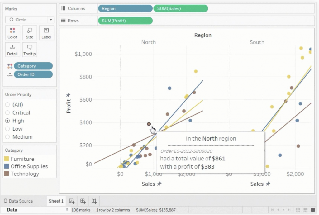
In many cases, the dashboarding of the data is extremely powerful and quickly understood. The greatest value in Tableau for many users is using multiple combined charts or displays. The different formats help to comprehend different aspects of the data. If you think of your data as a percentage of the whole, a pie chart is excellent to produce the desired impact. But if it’s not just a slice of 100% of that pie a bar graph may produce a more impactful message.
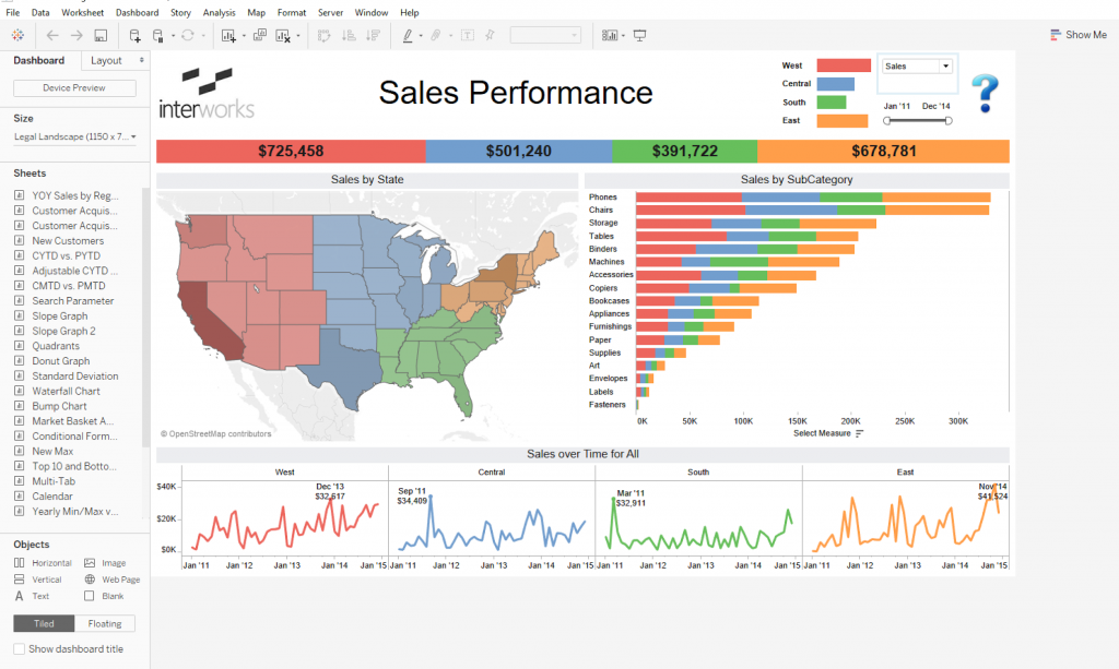
Geographical Mapping is an area that truly pushes Tableau into a different category since it’s so well versed at defining locations and illustrates them on a geographical map. You would need to develop most of this in longhand to replicate the map in a spreadsheet program.
If you’ve looked at Tableau, you know this doesn’t come for free, it’s a bit of a pricey program but the power it gives you to view and understand the data has a tremendous payback.
What benefit does using Tableau bring to you and your audience? For you, as the presenter, it is fast and easy to develop the information that builds these phenomenal graphics. It doesn’t necessarily matter where you get the information but for obvious reasons, you need that data to massage it into a message.
Think about a pie chart that illustrates OEE and separates downtime codes on machinery. There are many systems to build this graphic and to illustrate why decreasing setup is so important to improve your downtime causes. The pie chart is a very effective way to illustrate this and yes it can do a great job with this but let’s say that in the meeting they want the pie chart broken down by individual root causes, or, perhaps you are asked to illustrate this as a bar graph for each machine. This is where you can quickly look like a rock star by dragging and dropping the blocks into a different order and a different vision is created.
In the current days of zoom, this is even more important than it was in the boardroom because there seems to be an immediacy of zoom that drives a quick response.
For the viewer or the audience, it brings the story to life. It’s one thing to ask for an expenditure of $180,000 (€151,830) to move a piece of equipment to improve flow and reduce setup time but it can be much more impactful to show the results of the improvement, illustrate the reduced downtime’s OEE and the safety that this will encourage through employee studies.
The graphics in Tableau are impressive and the use of dashboarding multiple graphics really can convey the multiple faceted impacts of change. Toggling between the before and after brings home the message.
Tableau is very convenient to use different graphics to strengthen the message depending on the point of view or department. In many meetings we are not preaching to the choir so to speak, instead, we are in meetings with production, sales, maintenance, transportation, logistics, tooling, and purchasing.
Sometimes, even subsets within these groups like assembly, fabrication, paint, welding, etc. Since different departments have different goals and objectives not everyone in a meeting wants to see information in the same way or even the same statistics. Many times it’s better to deliver the information so they can understand how their piece of the puzzle impacts the other pieces.
Sales need to understand the strain that it creates by discounting a product at a price point below the market. Vice versa, it’s critical to understand that having a surplus in OEE time availability doesn’t do you any good if sales can’t fill this in the schedule.
Having market comparisons illustrates the sweet spot for production rates when you look at stamping; running too fast creates tears and scrap in the parts and material. Too slow and you’re not competitive with the industry and this shows in the price per part where it looks cheaper to outsource a part and by extension, lose manufacturing control.
All of these are best represented in different visuals that created diverse views of how a problem can appear depending on an individual viewpoint.
New exciting creations are being used by exploring the information by adding elements of action. Taking the static elements of charts but not morphing them in multiple views. This takes the viewer on a ride of emotion by showing them the views that are important but now, you’re steering the trip. This takes the randomness of how an individual’s eye may move across a screen or chart and now turns this into a movie or gif that we control the order of the message.
Think about how an elaborate topic showing trends and various product segments of a market can look.
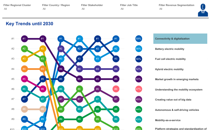
Extensive neural networks create complicated scenarios that can’t be communicated on a simple pie chart. This means it’s important to have the right chart for the right message. If you communicate using the wrong vehicle, you may be setting yourself up for disaster.
Information is more available than ever before and will continue to expand exponentially with greater sensor data and more accurate feedback. The improved data must match the audience’s needs and expectations if we want to create an optimal setting for our message to be absorbed.
Tableau is a tool like no other. Its message gives us the best tools for success when it comes to communication. It’s user friendly and puts the power of creation in the hands of the people who need it, when they need it!
The author is Joseph Zulick, manager at MRO Electric and Supply
Comment on this article below or via Twitter: @IoTNow_OR @jcIoTnow