As Human beings, we are visual creatures. We tend to prefer visual information over words. Traffic signs have a visual element so you can quickly identify the sign shape and color to recognise the information before you can even read the words.
Visualisation also can be universal where language cannot. We see many pieces of equipment with international symbols, this allows users in many countries with different languages to understand the message and the functions of the operation, says Joseph Zulick, writer and manager at MRO Electric and Supply.
Data visualisation provides much of the same, with much for the same reasons. We need a quick view of all critical information.
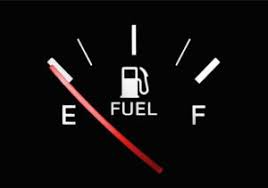
Think about the dashboard in your car. Yes, vehicles have the data to tell you that you have 2.5 gallons of gas left in the tank. However, many people are still more comfortable with the quick dial.
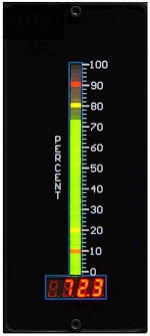
In many systems, analogue information can still be displayed in a useful format that can be easily and quickly processed by our brains. Is it easier for us to process the numbers 1-10, 1, 2, 3, 4, 5, 6, 7, 8, 9, 10 just by posting only one number ”7”?Is 7 good or bad? Many systems are incorporating a scale, and not every system is equal
A bar graph for instance can be valuable especially when it incorporates the warning level and the hazard level
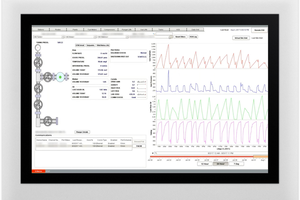
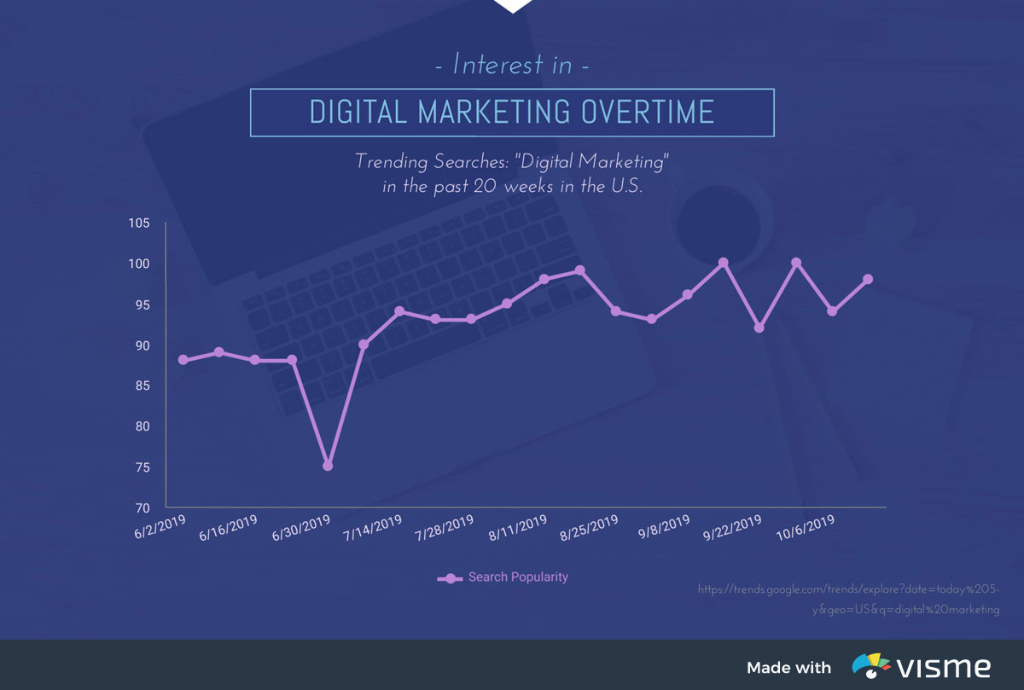
Sometimes a better representation is a line graph to plot over time. The is very nice for showing trends and even overlay one bar graph against another to show relationships between one line to another.
All of these charts or graph systems create visual platforms that still use much of the same IoT data that your back office system uses and creates a visual representation that best suits the application. They are still pulling this information from the machines that are providing information.
How the information is visually represented is just as important as what the information is to start. A poorly represented visual can destroy your message. At times it can even create a logical fallacy and represent false conclusions. Unfortunately, false information is far more common in data collection than most people realise.
Overall Equipment Effectiveness or OEE is often misrepresented. People apply their own formulas and tailor this to represent what people want to hear. No one wants to hear that they are running at 45% capacity. It’s much more appealing to leave out unscheduled time and remove that from the equation.
This may shift the OEE to 70% since you’re not counting the time that no one could sell that machine’s runtime to a customer, therefore they don’t count it in their formula. OEE should be a true representation of all the time that the machine is available 24/7/365. The fact that you choose not to run it on the second shift because you don’t have an operator or a job to put in the machine is not the machine’s fault.
Pie charts can help represent this and improve the solution to improve this situation as opposed to leaving the information out of the visual and not addressing the problems. HR personnel’s shortcomings should be addressed in your reporting as well as sales for not creating enough work for this equipment.
This being said, the visualisation needs to apply to the audience. This type of information is not relevant to the operator, and you need to show the data that is appropriate for them to see and reflects on their contribution and success. The other data can be produced in other reports for the other meetings such as showing the sales staff why it’s important to sell machining time, how it impacts the productivity of the entire plant. Too often data is taken out of context such as saying go out and work harder and also just showing raw numbers and what that means.
Data is a visual commodity and should be represented as such.
Formulas are also very visual, increasing the denominator, lowers the resultant. In other words, it’s better to have 2 out of 5 than it is to have 2 out of 7.
Gantt charts are great for showing how one item flows into another. These are fantastic to gain perspective on how your contribution impacts the next process.
Flow charts are seen on these to create a message board for troubleshooting and decision making. These show us alternative paths but mainly if an alarm is shown, you will need to address the downstream process.
Scatter graphs look like a shotgun blast with just arbitrary points but that’s not true. Many times scatter graphs are plotted against averages or some form of change that moves these somewhat arbitrary points up or down. As an example, think about instantaneous values of your heart rate, they just seem like they are all over the place but when you plot them against exercise you see a trend of these points. If you plot them over time you will see the resting heart rate brings the low points lower and high points higher as you increase exercise intensity.
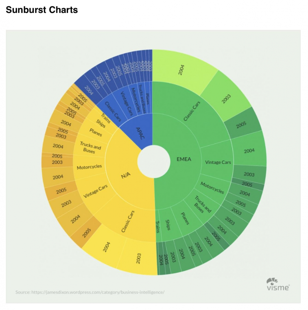
Using information against baselines allows us to develop more advanced pie charts with levels and quadrants which give us better representations of what is happening.
Think about our IIoT information. Initially, a pie chart represents the time spent on various tasks on your plant floor. We continue to do more monitoring as well as drilling down from a loss of time due to tooling, now we break it down into sharpening, replace pins and bushings, perhaps even breaking it down by tooling stations.
This gives us more quadrants within these pie slices which helps us to see the percentage of each of these while not losing the overarching pie slice “tooling”, while still providing the detailed information from specific subsections. These are referred to sometimes as sunburst charts.
On the new data displays, we have more and more pixels to display greater detail but still have the ability for that quick look where we can instantaneously know if we’re doing well or doing poorly.
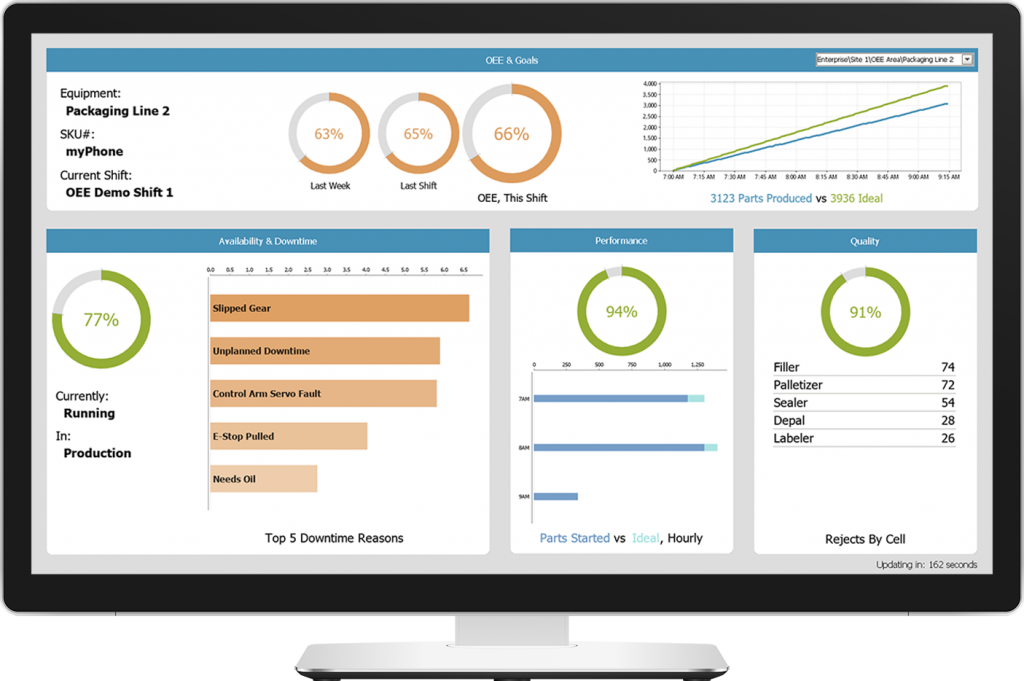
The best systems combine multiple elements, they use bar graphs, pie charts, line graphs, and more to display the details found in the manufacturing areas. Often different data displays are used in maintenance areas that provide data that not only provides analysis details but give more pictorial details that can be used by maintenance people to understand the device they’re monitoring, perhaps a valve, a motor, maybe a storage tank, etc. couldn’t these be simply displayed using blocks with valve written on them, sure, however you should know that people respond better to more accurately represented device pictures.
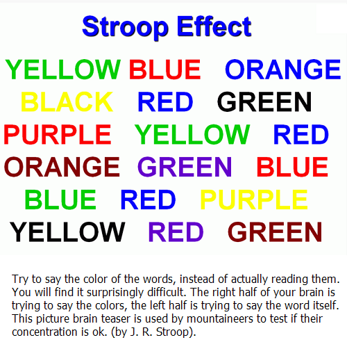
Think about this old psychology experiment, the Stroop Effect, where they keep showing you flashcards with the color and the word on them and you have to say the color not the word quickly.
The Stroop effect is used to test your concentration. This illustrates that we need to have complementary information in different formats.
This shows that just reading representing data in one style (written) is only so effective for communicating the information. By showing a valve and the valve number and showing the chain of valves in the flow chart, gives a greater comprehension and a quicker response by personnel.

Think back to early computers where you had to type in a program name to launch the program along with the run command. We use GUI Graphical User Interfaces now and it’s led to faster adoption of technology. A 3-year-old can find a picture of grandma and dial the phone. We want simple, fast comprehension with quick adoption, visualised data gets us there.
The author is Joseph Zulick, writer and manager at MRO Electric and Supply.
Comment on this article below or via Twitter: @IoTNow_OR @jcIoTnow